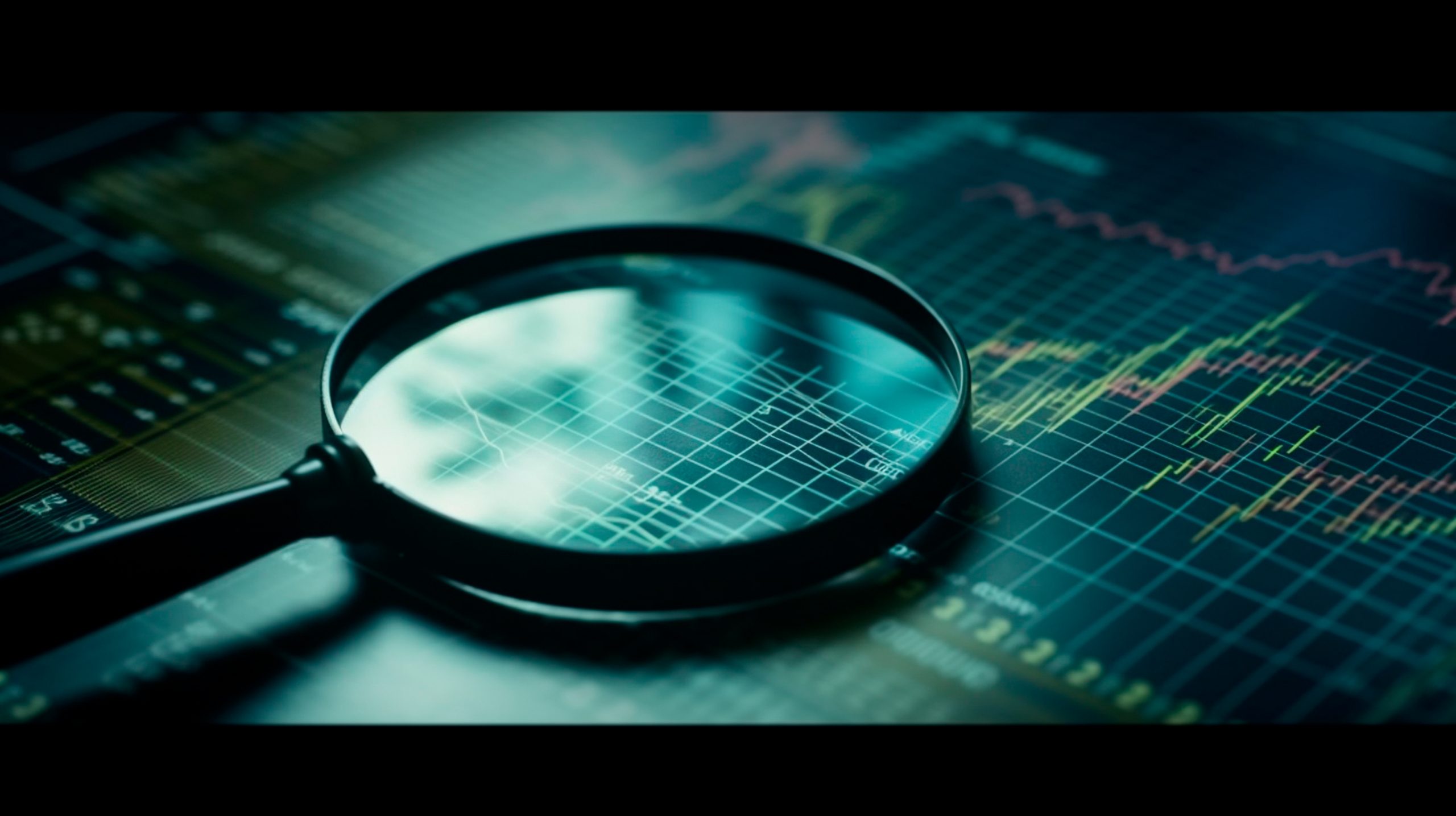
To analyse currency pairs’ changing prices effectively, traders require a robust mechanism for examining historical and current price behaviour. The primary tool in technical analysis is a price chart, which serves as a graphical representation of price movements over specified timeframes.
This article will explore the different types of price charts, how to read them, and the insights they offer traders.
What Are Price Charts?
A price chart is a visual representation of a financial instrument’s price activity over time. It captures every trade transaction for that asset within a defined timeframe—be it minutes, hours, days, or weeks. By analysing price charts, traders can glean insights into market behaviour, identify trends, and make informed trading decisions.
The Importance of Price Charts
Price charts are essential for several reasons:
- Visualisation of Price Movements: They provide a clear visual representation of price fluctuations over time, making it easier to identify trends and patterns.
- Understanding Market Sentiment: Price charts encapsulate the collective behaviour of market participants, reflecting their reactions to news, economic events, and other factors influencing supply and demand.
- Risk Management: By recognising trends and potential reversal points, traders can better manage risk and make strategic trading decisions.

Types of Price Charts
Understanding the various types of price charts is crucial for effective analysis. The three most common types are line charts, bar charts, and candlestick charts.
1. Line Charts
Line charts are one of the simplest forms of price charts. They plot the closing prices of an asset over time, connected by a continuous line. This chart type is ideal for identifying overall trends without the distraction of price fluctuations throughout the trading period.
How to Read Line Charts
- Trend Identification: Line charts effectively show whether an asset is trending upward, downward, or sideways.
- Timeframes: Traders can adjust the timetable of the line chart to analyse short-term or long-term trends.
2. Bar Charts
Bar charts provide more detailed information than line charts. Each bar represents the price action for a specific period, displaying the open, high, low, and close prices (OHLC). This additional data helps traders assess price volatility and market momentum.
How to Read Bar Charts
- Understanding OHLC: The left side of the bar indicates the opening price, while the right side shows the closing price. The vertical line represents the range of prices (high and low) during that period.
- Analysing Price Movements: A longer bar indicates higher volatility, while shorter bars suggest consolidation.
3. Candlestick Charts
Candlestick charts are similar to bar charts but present the data in a more visually appealing format. Each candlestick represents the same OHLC information, but with the candle’s body colored to indicate whether the closing price was higher or lower than the opening price.
How to Read Candlestick Charts
- Body Color: A filled (red or black) candlestick indicates a closing price lower than the opening price, while an empty (green or white) candlestick shows a closing price higher than the opening price.
- Patterns and Formations: Candlestick patterns, such as doji, hammer, and engulfing patterns, can signal potential reversals or continuations in price trends.
What Does a Price Chart Represent?
Price charts encapsulate the dynamic interplay of supply and demand in the market. Every transaction—whether from retail traders, institutions, or algorithms—contributes to the overall picture depicted in the chart.
Supply and Demand Dynamics
Price charts reflect how supply and demand fluctuate over time. Each price movement represents the culmination of countless buying and selling decisions influenced by news, economic indicators, and market sentiment. Traders interpret these fluctuations to gauge future price movements and adjust their strategies accordingly.
The Role of Market News
Price charts integrate both historical and real-time information. As new data and news emerge, traders revise their expectations, causing further price adjustments. This ongoing cycle of reaction and adaptation is crucial for understanding market trends.
Reading and Analyzing Price Charts
To maximise the benefits of price charts, traders must learn how to read and analyse them effectively. Here are some key steps:
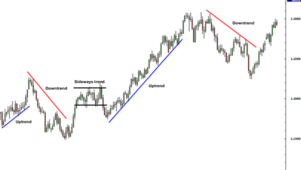
1. Identify Trends
Recognising trends is fundamental to trading. Determine whether the price is moving upward, downward, or sideways. Utilise trendlines to visualise these movements and establish potential entry and exit points.
2. Look for Patterns
Patterns like head and shoulders, double tops, and triangles can provide insights into future price movements. Familiarising yourself with these formations will enhance your ability to anticipate market behaviour.
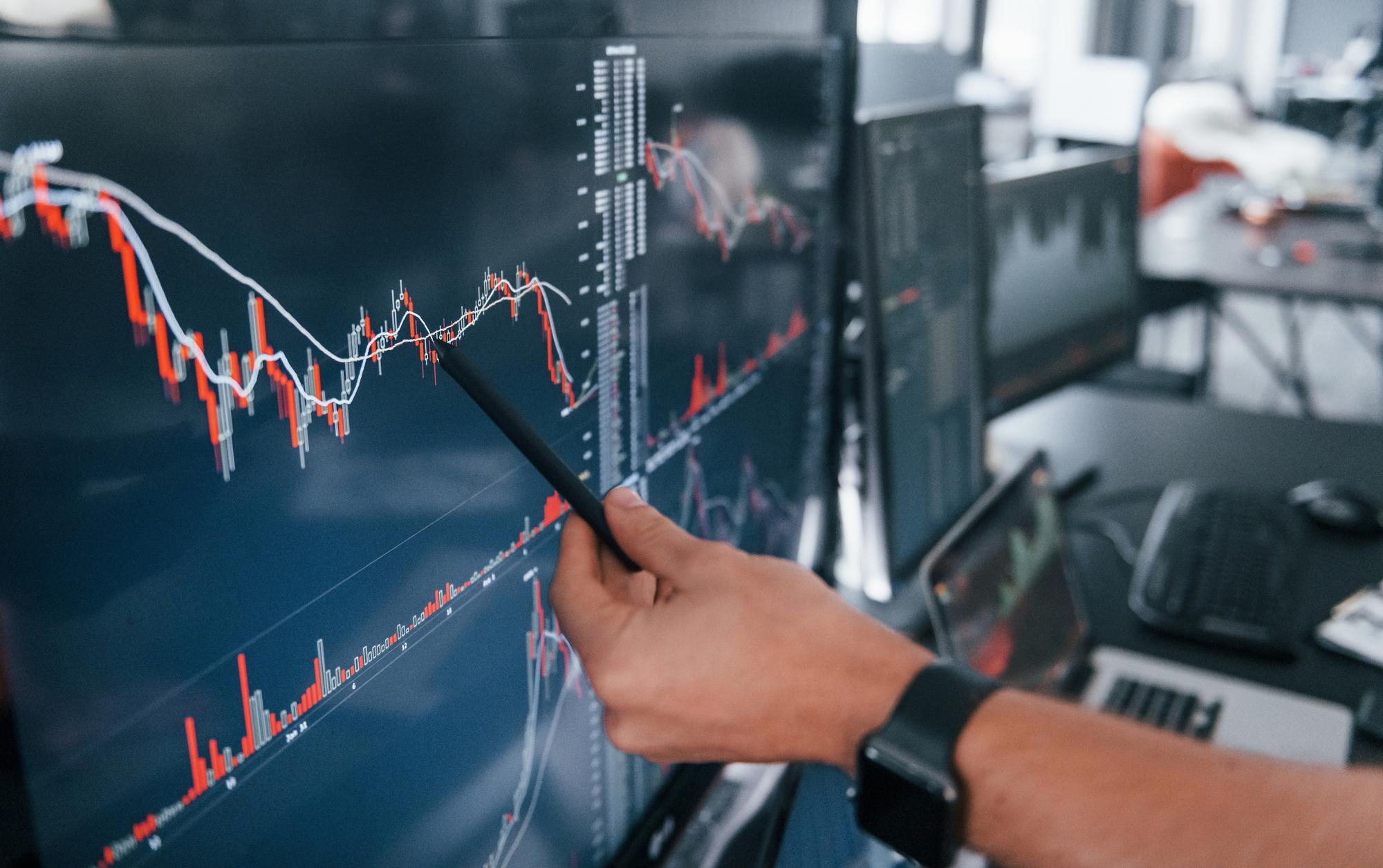
3. Use Indicators
To supplement your analysis, include technical indicators, such as moving averages, RSI (Relative Strength Index), and MACD (Moving Average Convergence Divergence). These tools can provide additional confirmation of trends and potential reversal points.
4. Monitor Volume
Volume is a critical aspect of price charts. Analysing volume alongside price movements helps determine the strength of a trend. High volume during price increases suggests strong buying interest, while low volume may indicate weak momentum.
5. Practice Risk Management
Consistently implement risk management strategies. Use stop-loss orders and position sizing to protect your capital. Analysing price charts can help you identify levels where you can effectively place these risk management tools.
Understanding the various types of price charts and how to read them is vital for any trader aiming to navigate the complexities of the financial markets. By leveraging line, bar, and candlestick charts, traders can gain valuable insights into market trends, identify trading opportunities, and manage risk effectively.
As you delve deeper into technical analysis, remember that price charts are not just tools for visualisation—they embody market sentiment, reflecting the collective actions of countless participants. Mastering the art of reading these charts will empower you to make informed trading decisions and enhance your overall trading strategy.
In the fast-paced world of trading, knowledge is power. Equip yourself with the skills to interpret price charts effectively, and you’ll be better prepared to seize opportunities and confidently navigate the market.
As you embark on your trading journey with Vestrado, remember that mastering price charts is vital to achieving your financial goals. By understanding the various charts and learning how to read them effectively, you can gain deeper insights into market trends and make more informed decisions.
At Vestrado, we are committed to empowering you with the tools and knowledge needed to navigate the complexities of trading confidently. Join our community of traders, share your experiences, and let’s grow together as we strive for success in the dynamic world of finance. Your journey starts here—let’s make every trade count!